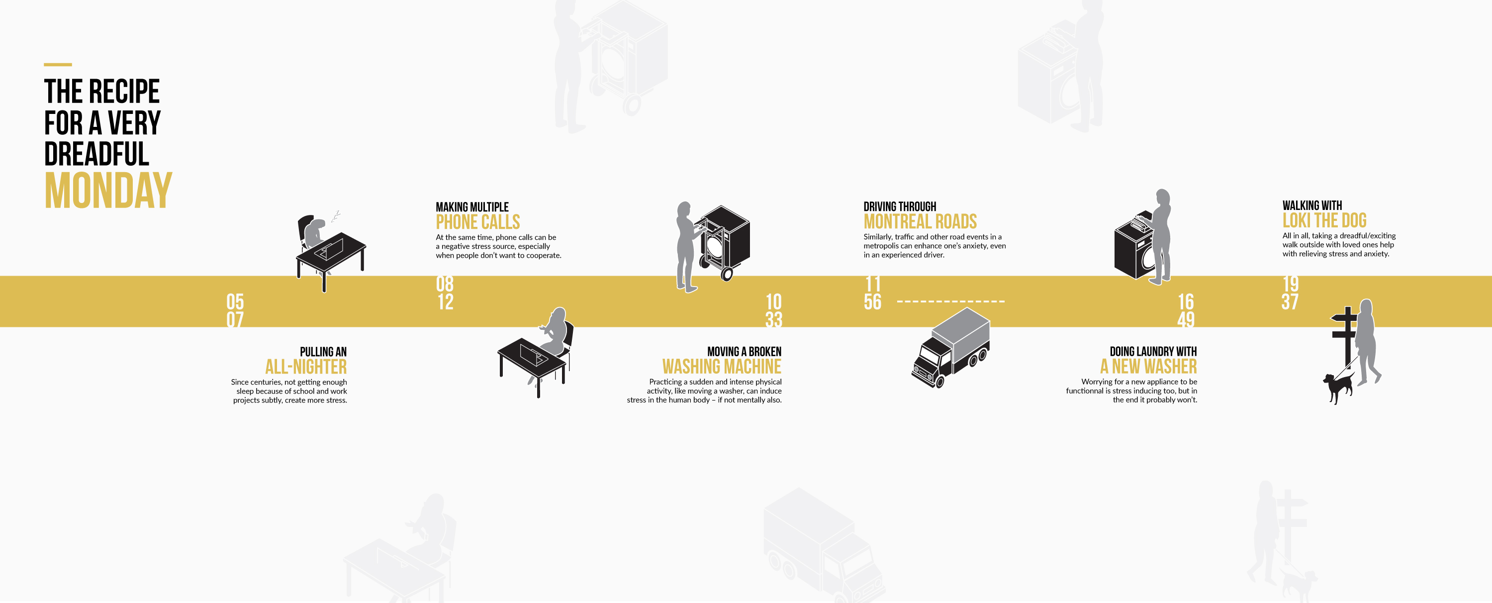

The symbols, done sketched by hand then finalize with Adobe Illustrator were created to convey and support the daily experience in a timeline-based story infographic.
To better support the graphics and overall visual, I made the choice of the color yellow to accompany the more neutral colors black and white to represent the frustration, stress and also cheerfulness I had that day boiling inside.
Aside from the color, the overall design was chosen to convey the timeline base story and retake the balanced design of the icons. While the design is pretty much 2D compared to the isometric icons, it creates a beneficial contrast that distinguish well the elements while still blending correctly. Plus, the pale gray copies of the icons on the edges bring back to the front the subtle effect of stress - always there in the corner of your mind.
In the infographic, I opted to create the important elements with yellow to bring attention to the story and not the individual symbols for a better reading of the infographic, while keeping it significance.


